Shen, Chi
April 18 2020, New Haven, CT
一直以来都是用Wagstaff那本书中的code画集中曲线,但是不好看,试着用ggplot2画出更好看的图
示例数据来源于Analyzing Health Equity Using Household Survey Data一书中的AE8。
library(dplyr)
library(magrittr)

df <- haven::read_dta("/Users/Chi/Documents/Method Learn/Statistic Book/AHE-SupplementalMaterials/AHE_Master/AHE data files/AHE8.dta")

df_1 <- rename(df, y=opsub, x=hhexp_eq) %>% na.omit()

df_1 %<>% mutate(raw_rank=rank(x)) %>% arrange(raw_rank) %>%
          mutate(wi=wt / sum(wt),
                 cusum=sum(wi),
                 wj=lag(cusum),
                 wj1=ifelse(is.na(wj), 0, wj),
                 rank=wj1 + 0.5 * wi)
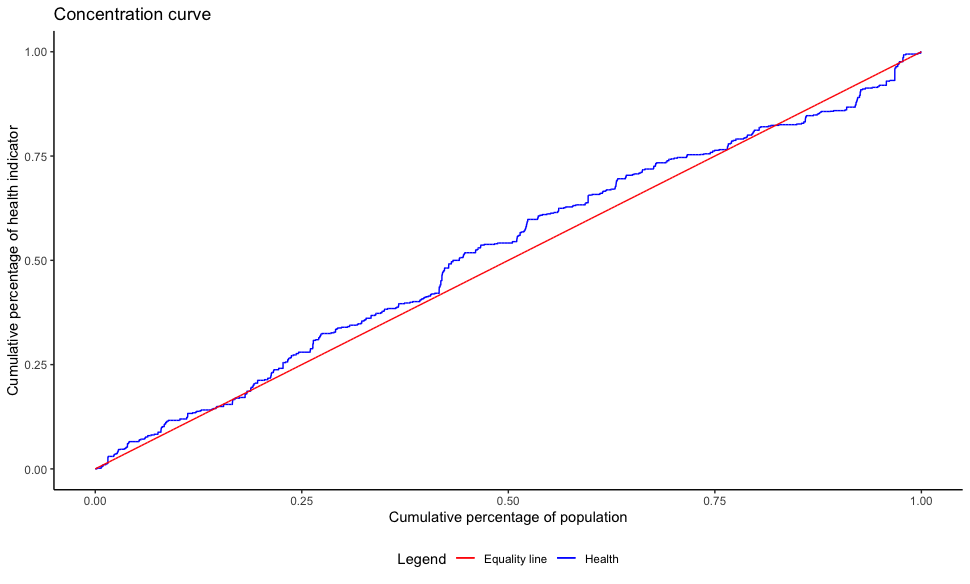
单组
适用于只有一个health indicator或者是health indicator只有一个分类的情况
library(ggplot2)
library(ggsci)

concentration_curve <- function(df, health_var, rank_var, health_lab="Health"){

    dt <- rename(df, "rank"=rank_var, "health"=health_var)
    dt %<>% arrange(rank)
    cumul_porp_y <- c(0, cumsum(dt$health) / sum(dt$health))
    cumul_porp_x <- seq(0, 1, 1 / (length(cumul_porp_y)-1))

    df_plot <- data.frame(cumul_porp_x, cumul_porp_y)

    ggplot(df_plot) +
        geom_line(aes(cumul_porp_x, cumul_porp_y, color=health_lab)) +
        geom_line(aes(cumul_porp_x, cumul_porp_x, color="Equality line")) +
        scale_colour_manual(name="Legend",
                            values=c("red", "blue")) +
        labs(title = "Concentration curve",
             y = "Cumulative percentage of health indicator",
             x = "Cumulative percentage of population") +
        theme_classic() +
        theme(legend.position="bottom")

}

concentration_curve(df_1, "y", "rank")
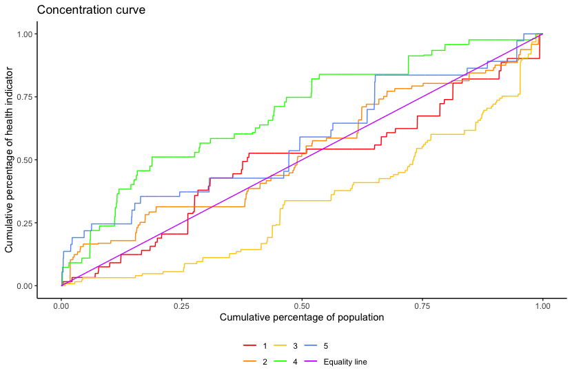
多组
适用于observation有多组的情况,当然也可以通过长宽数据形式转换,将多个variables转换成group变量,来实现将多个变量画在同一个figure中。
concentration_curve_group <- function(df, health_var, rank_var, grp_var){

    dt <- rename(df, "rank"=rank_var, "health"=health_var, "group"=grp_var) %>%
          select(c("rank", "health", "group"))
    dt %<>% group_by(group) %>%
            arrange(rank) %>%
            mutate(cumul_porp_y=cumsum(health) / sum(health),
                   cumul_porp_x=seq(0, 1, 1 / (length(cumul_porp_y)-1)))

    ggplot(dt) +
        geom_line(aes(cumul_porp_x, cumul_porp_y, color=factor(group))) +
        geom_line(aes(cumul_porp_x, cumul_porp_x, color="Equality line")) +
        scale_colour_ucscgb(name = "") +
        labs(title = "Concentration curve",
             y = "Cumulative percentage of health indicator",
             x = "Cumulative percentage of population") +
        theme_classic() +
        theme(legend.position="bottom")

}

concentration_curve_group(subset(df_1, strata<=5), "y", "rank", "strata")