Shen, Chi
May 19 2020, New Haven, CT
在towards data science上看了一篇文章,觉得挺好,画图这个事儿,确实需要些审美。
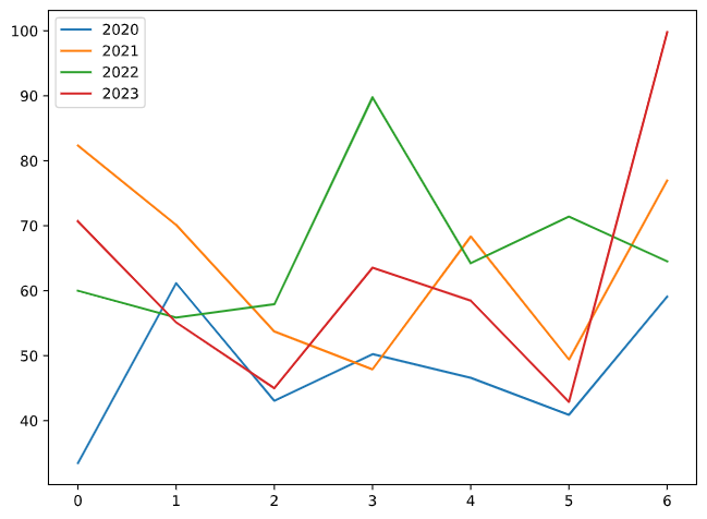
1. 草图
先来画个草图,也就是一般软件给出的初步图形
import numpy as np
import matplotlib.pyplot as plt

fig, ax = plt.subplots(figsize=[8, 6])

for i in [2020, 2021, 2022, 2023]:
    np.random.seed(i)
    x = np.arange(7)
    y = np.random.normal(60, 15, 7)
    ax.plot(x, y, label=i)

ax.legend()
2. 定义色板
科研作图中配色是很讲究的,一般Journal推荐的是黑白色,因为印刷成本低,但是现在多数都online press了,所以可以用彩色了。
这里我就偷懒用了现成的Top Journal的配色了,rgb的色号参考的是这个网站https://nanx.me/ggsci/reference/pal_lancet.html,这个也是R里面ggsci包的说明链接,推荐科研懒人使用,特别方便
import seaborn as sns

lancet_light_pal = ["#00468B99", "#ED000099", "#42B54099", "#0099B499", "#925E9F99", "#FDAF9199", "#AD002A99", "#ADB6B699", "#1B191999"]

lancet_pal = ["#00468BFF", "#ED0000FF", "#42B540FF", "#0099B4FF", "#925E9FFF", "#FDAF91FF", "#AD002AFF", "#ADB6B6FF", "#1B1919FF"]

nejm_pal = ["#BC3C29FF","#0072B5FF", "#E18727FF", "#20854EFF", "#7876B1FF", "#6F99ADFF", "#FFDC91FF", "#EE4C97FF"]

nature_review_cancer_pal = ["#E64B35FF","#4DBBD5FF", "#00A087FF", "#3C5488FF", "#F38B7FFF", "#8491B4FF", "#91D1C2FF", "#DC0000FF", "#7E6148FF", "#B09C85FF"]

sns.set_palette(nature_review_cancer_pal)
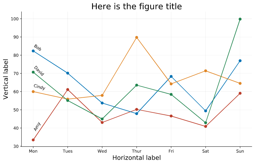
3. 加基本元素
一个标准的science figure,横纵轴标题、坐标轴标签是必不可少,标题可按需求添加。
对于line plot,一般配合加上scatter plot会显得图更明确。
另外一点是,legend在比较少的情况,放在线条上是个不错的想法,这个是上面说提到的文章中的做法。
把该加的基本元素加上了之后,图好像就像那么回事儿了。
def ploting(ax, pal=lancet_pal):

    sns.set_palette(pal)
    y_list = []

    for i in [2020, 2021, 2022, 2023]:
        np.random.seed(i)
        x = np.arange(7) + 1
        y = np.random.normal(60, 15, 7)
        y_list.append(y[0])

        ax.plot(x, y)
        ax.scatter(x, y)

    ax.set_xlabel("Horizontal label", fontsize=15)
    ax.set_ylabel("Vertical label", fontsize=15)
    ax.set_title("Here is the figure title", fontsize=20)

    ax.set_xticklabels(["", "Mon", "Tues", "Wed", "Thur", "Fri", "Sat", "Sun"])

    ax.text(1, y_list[0] + 5, "Amy", rotation=60)
    ax.text(1, y_list[1], "Bob", rotation=-35)
    ax.text(1, y_list[2] + 1, "Cindy", rotation=-15)
    ax.text(1, y_list[3] - 2, "David", rotation=-45)

fig, ax = plt.subplots(figsize=[10, 6])
ploting(ax, nejm_pal)

4. 加背景线条
有的期刊比较喜欢在图中加上背景虚线,比如一些经济学类的期刊,特别是时间序列图的时候。
至于是空白的好看还是有虚线好看,就可个人审美了。
fig, ax = plt.subplots(figsize=[10, 6])
ploting(ax, nejm_pal)

ax.grid(color='grey', linestyle='-', linewidth=0.25, alpha=0.5)

5. 修改图边框
一般的统计图形会去掉上方和右侧的边框线条,完全呈现成坐标轴的形式。
fig, ax = plt.subplots(figsize=[10, 6])
ploting(ax, nejm_pal)

ax.grid(color='grey', linestyle='-', linewidth=0.25, alpha=0.5)
ax.spines['top'].set_visible(False)
ax.spines['right'].set_visible(False)
还可以添加的元素还有很多,比如在图中加text,annotate等等,但是图只要具备自明性就好了,添加太多元素反而即花时间又显得太拥挤。